The modernization of an outdated events platform - a project created to attract new users to Constant Contact, my role in this project was to design the events dashboard and reporting tool.
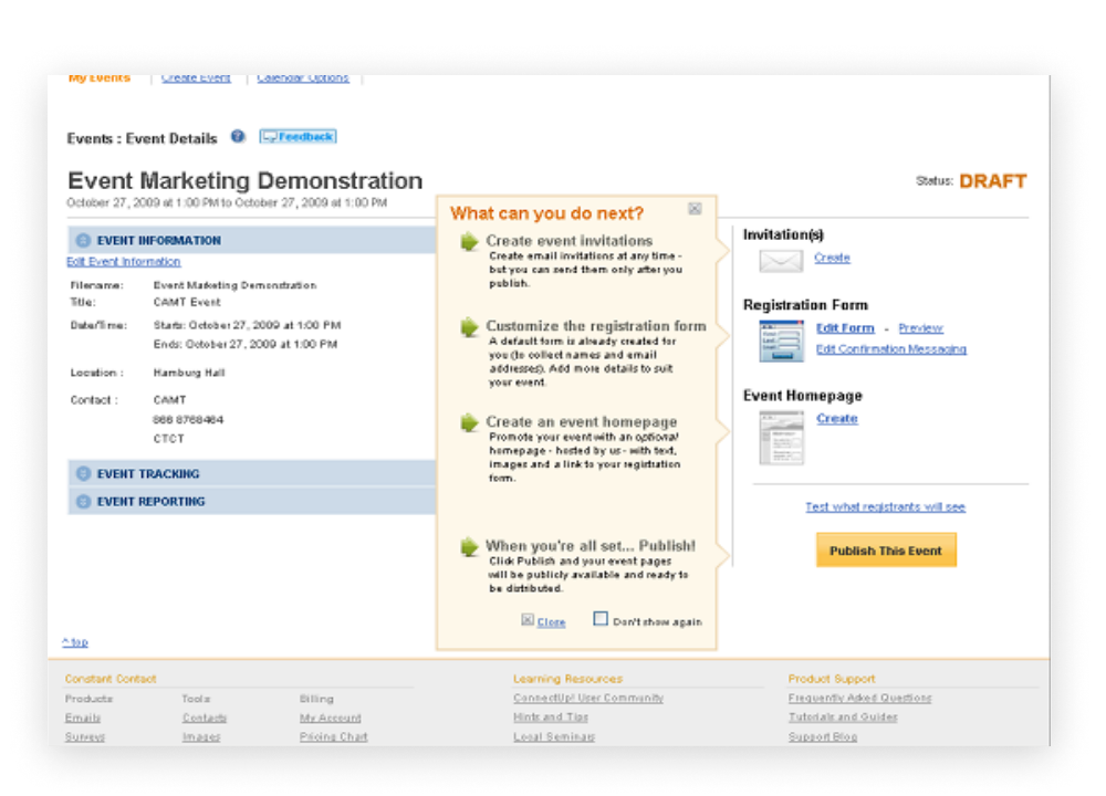
Constant Contact is best known for its email template creator — but tucked among its offerings is a full events platform, letting users create events, send invites, and view reports. The problem: its design was outdated, reminiscent of the 90s, and suffered from excessive clicks and confusing interactions.
In 2022 the company pushed to revamp the platform. A senior designer owned the create/edit experience — my focus was the event dashboard screen: the home base where organizers track how their event is doing.
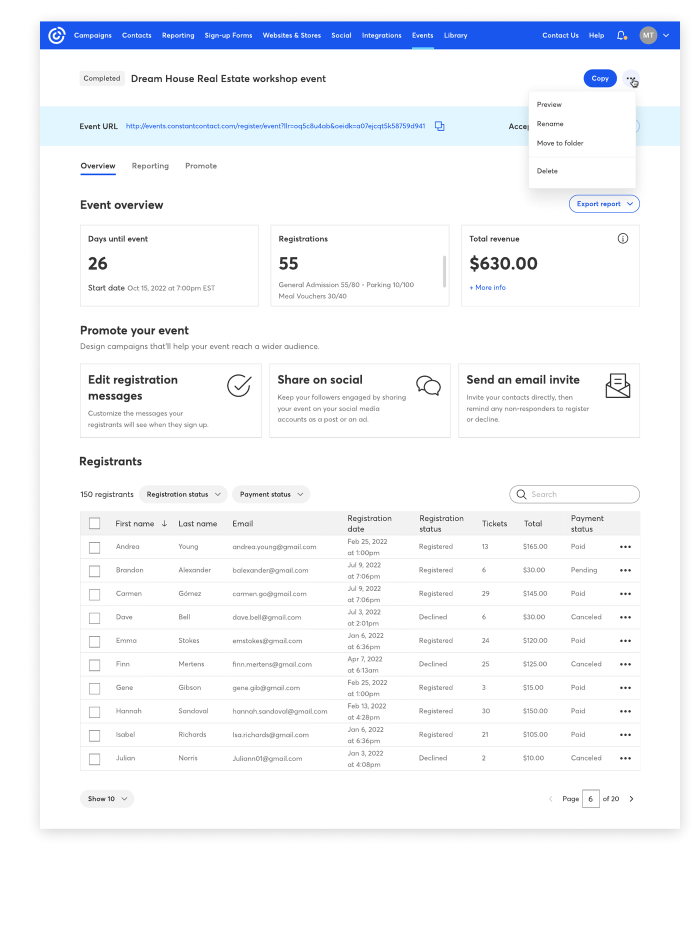
The starting point. The legacy screen crammed event information, tracking, and publishing steps into a dense, link-heavy layout. Key data like ticket sales and revenue was hard to find, and common tasks took too many clicks.

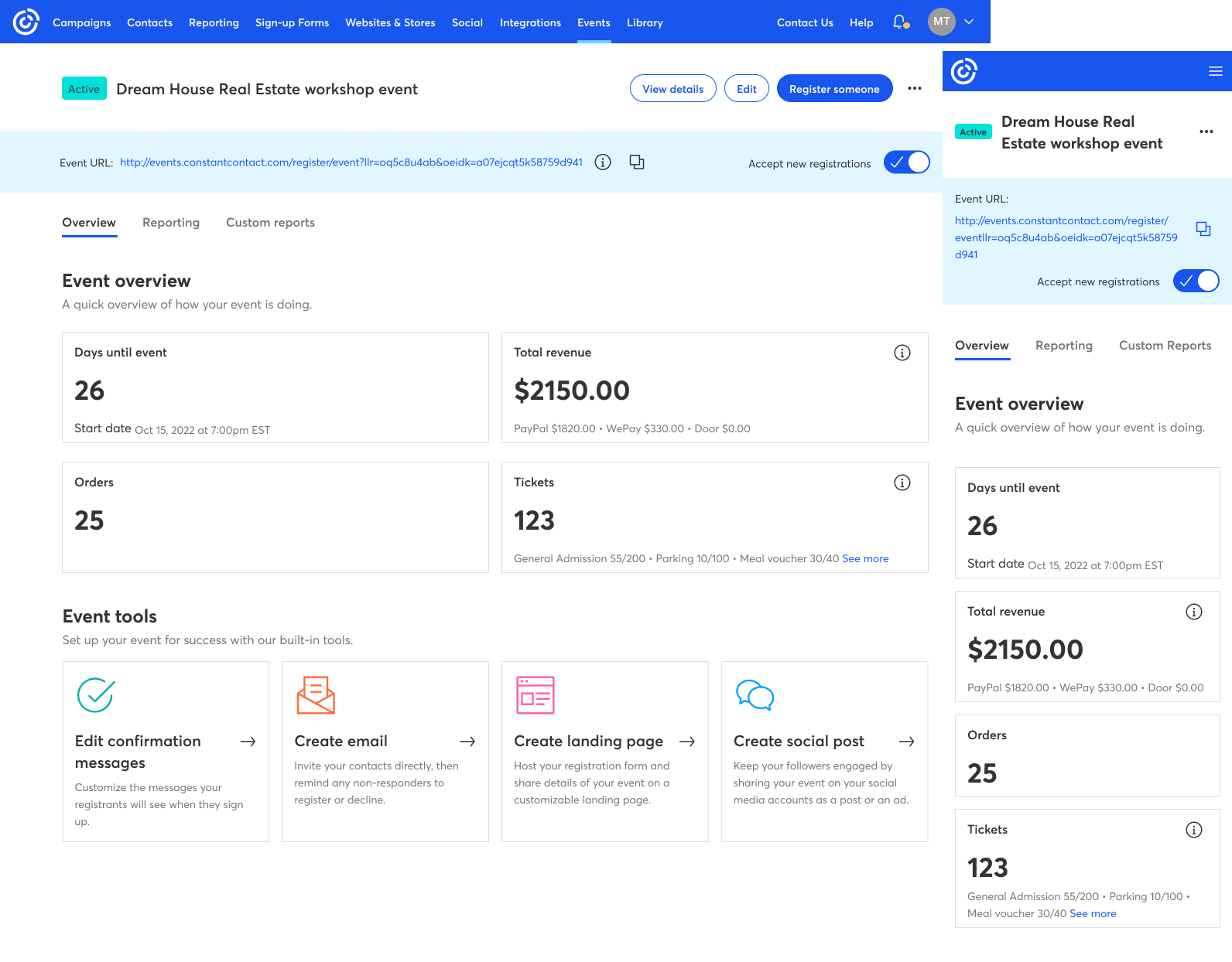
Surface the metrics that matter — tickets sold, revenue, event location, event link, list of guests, and more — everything essential for an event dashboard.
Retain email invites and enable creation of custom event landing pages and other communication campaigns, right from the dashboard.
Existing events users were a significant portion of the clientele. The new structure had to respect their established patterns to prevent confusion in the transition.
I studied how the best in the events industry present dashboard data.

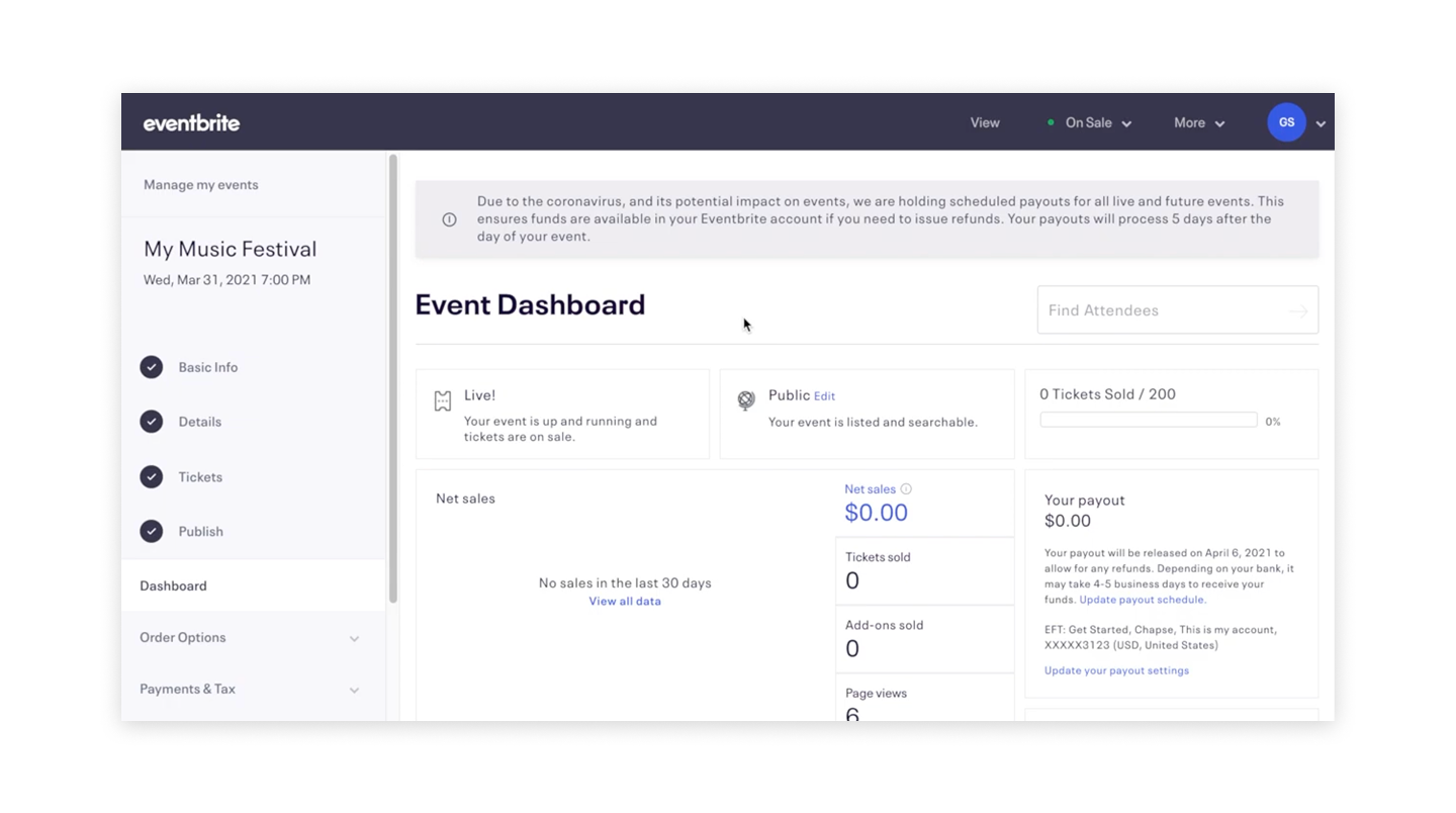
The industry leader — I admired its intuitive navigation and how it showcased relevant data. My goal: a navigation system that integrated with Constant Contact's existing patterns while borrowing Eventbrite's user-friendly qualities.

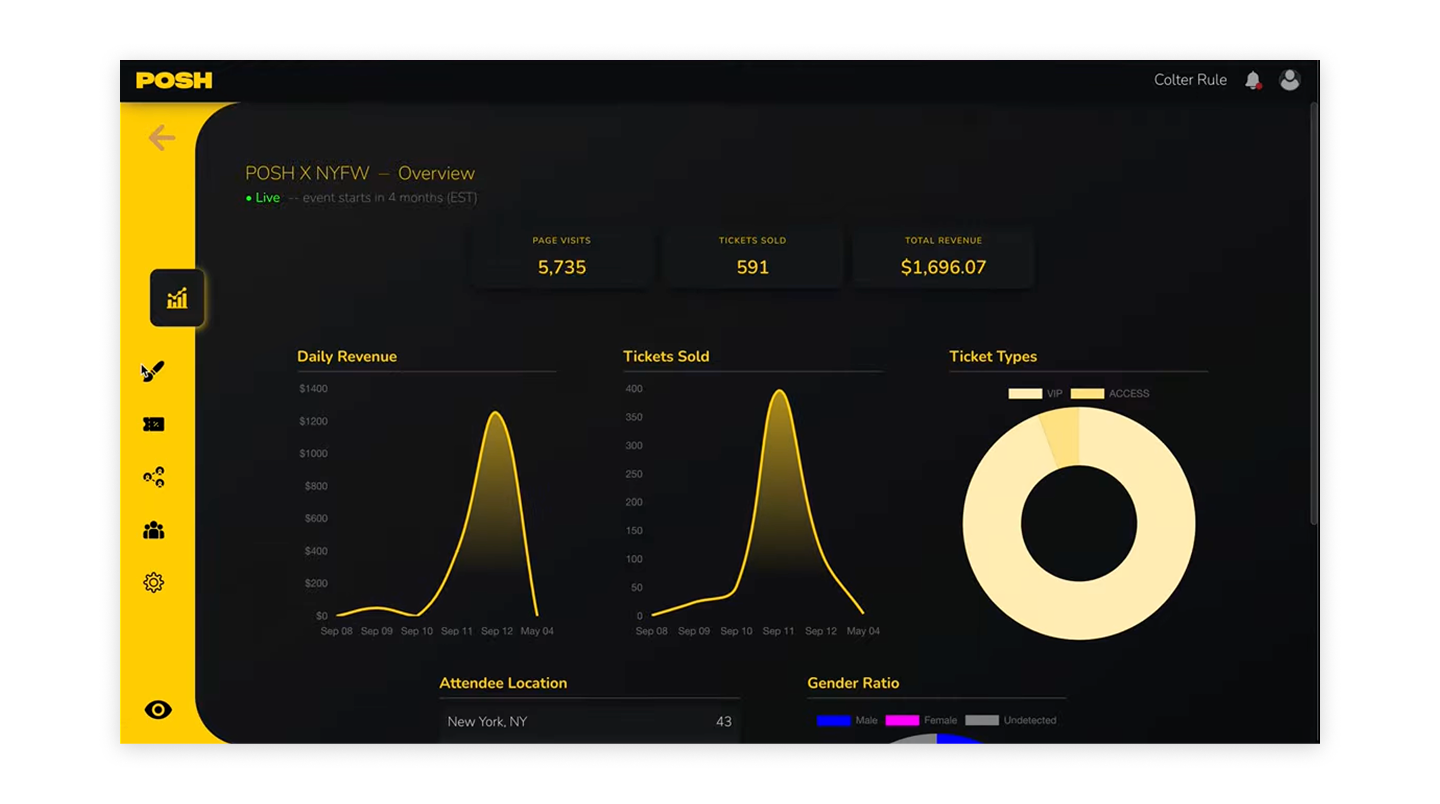
A modern challenger — graph-driven data display, attendee insights like gender ratio, and a dark visual design that highlights key data and evokes excitement.
A previous designer's first iteration blended an overview page with reporting content — including a full registrants table. Our UX team recognized that table belonged in the reporting tab instead.
The screen started with just three data points: days until event, registrations, and total revenue. After reviewing the prototype with users and receiving their input we made the appropriate changes that would satisfy both user and business needs.

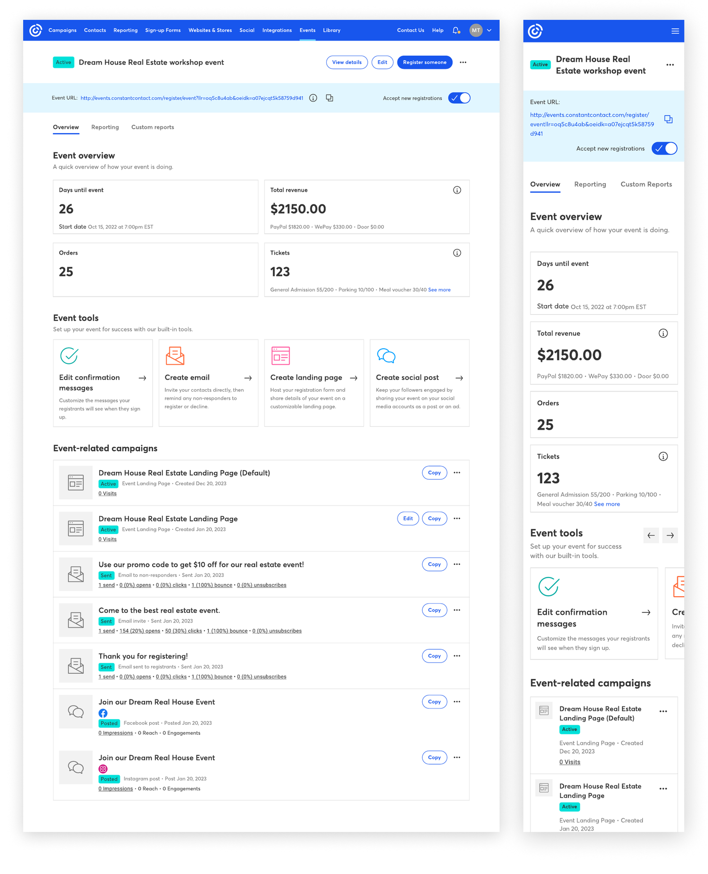
After several iterations, user testing, and evolving business needs, the final dashboard showcases four key metrics — days until event, total revenue, orders, and tickets — plus an event tools section for creating campaigns and a view of stats on existing event-related campaigns.

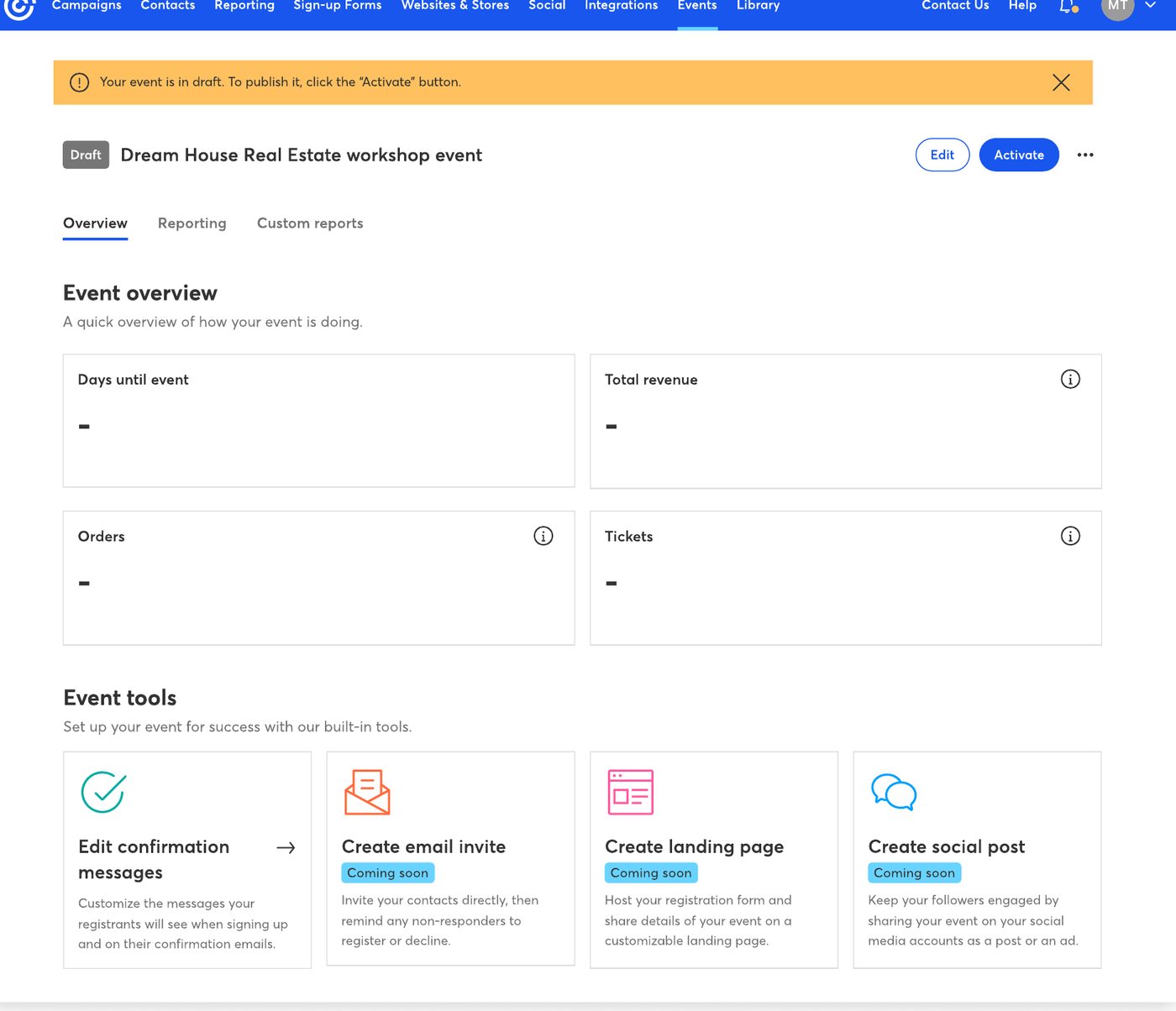
A dashboard isn't one design — it's a system of states. I mapped how data and available features change with the status of the event.
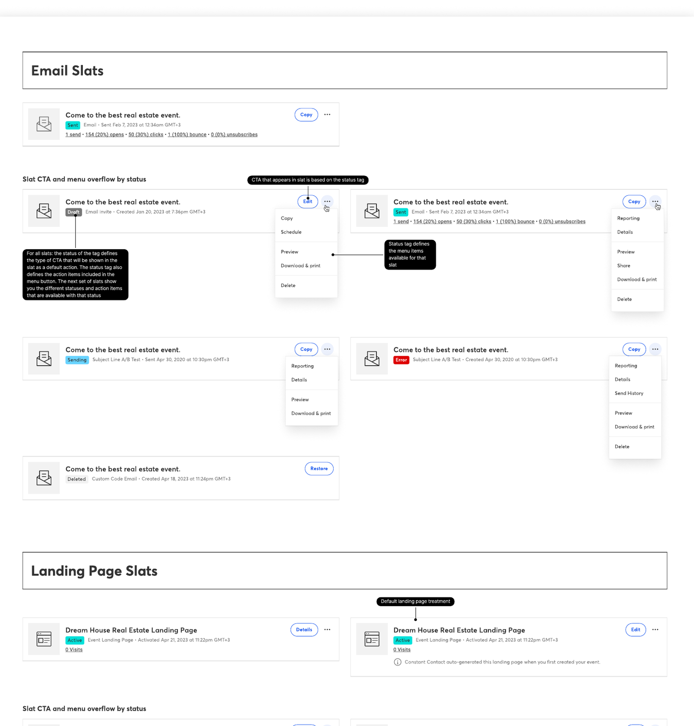
Each state answers a question: what should an organizer see before the event is live? Which tools remain when it ends? What happens to revenue metrics on a free event? I also documented every campaign slat status — draft, sent, sending, error, deleted and more — in a Figma frame for developers, defining the CTA and menu actions for each.


Moderated and unmoderated testing sessions — run with a UX content designer — shaped the final design at every step.
A full state and status system documented in Figma, from event lifecycle states to per-status campaign slat behavior.
"An informed design is important in ensuring the success of the user experience." This was one of the most extensive projects I've worked on — balancing business requirements, existing user habits, and a modernization of a platform, all in one screen.