Three years as a design systems contributor — building components, writing specs for developers, maintaining the Figma library, and rebranding an entire product from its atoms up.
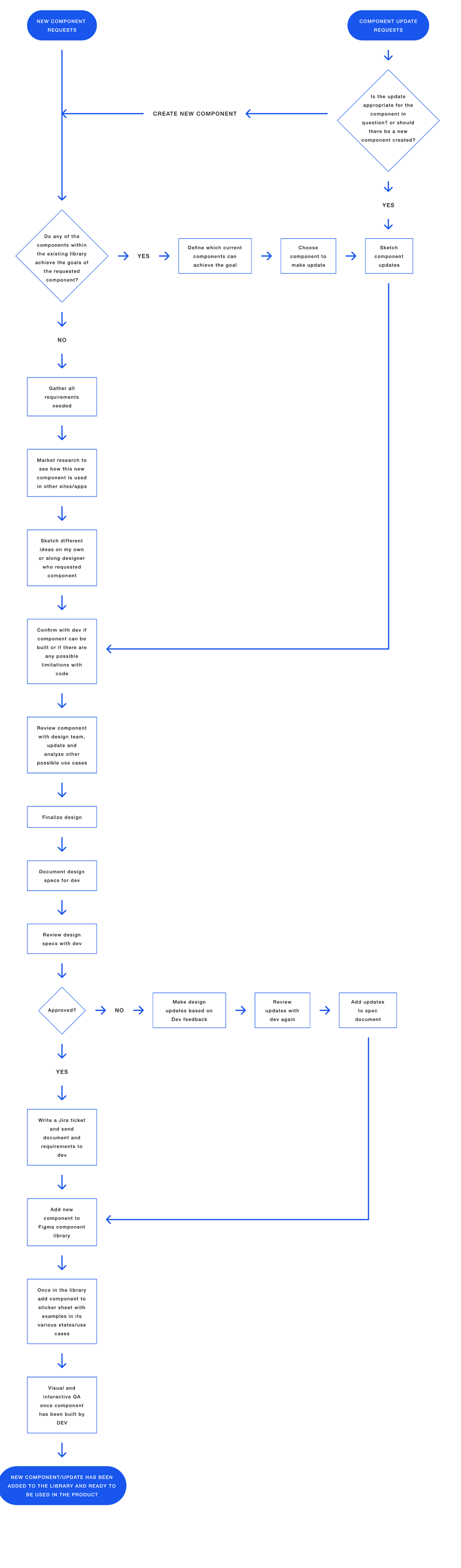
Working alongside the design systems lead, my projects arrived in four recurring forms.
From request to requirements, market research, sketches, dev feasibility, team review, and final specs.
Evaluating whether an update belongs in an existing component — or justifies a new one entirely.
Maintaining the Figma component library, stickersheets, and component documentation.
Company rebrand project, change styles and components in the library from the atomic level and up.
Every component followed a defined path: gather requirements, research how other products use it, sketch — solo or with the requesting designer — then confirm feasibility with developers before finalizing.
Final designs became spec documents reviewed with the dev team, added to the Figma library and stickersheet, and QA'd visually and interactively once built.
The flow's first question was always the same: can an existing component already achieve this goal? Protecting the library from duplication was as important as adding to it.

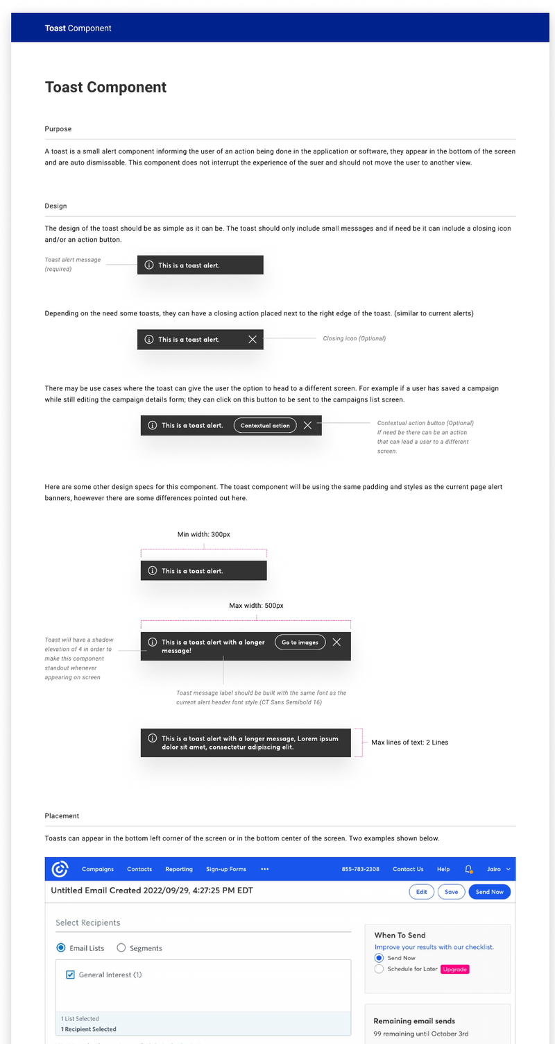
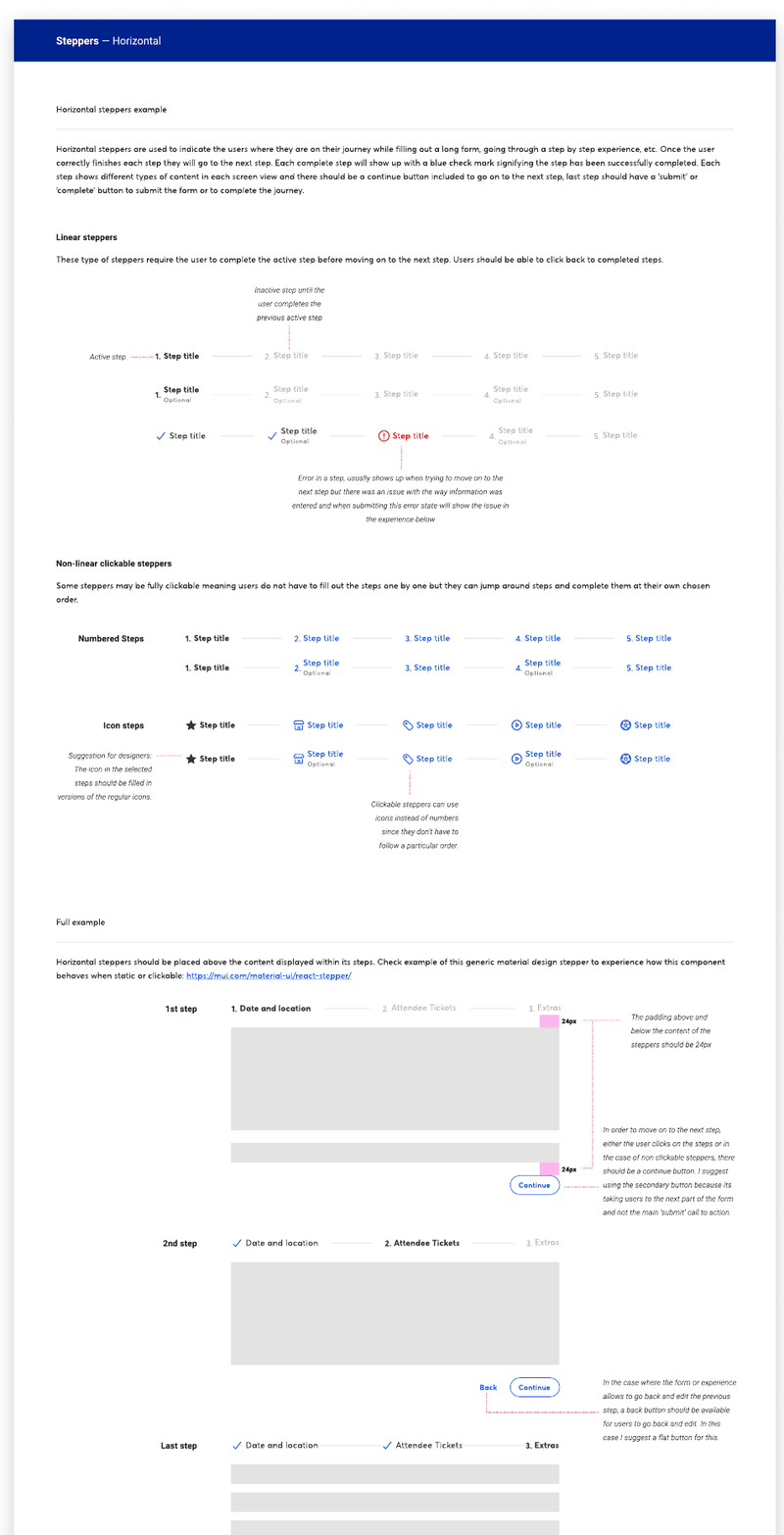
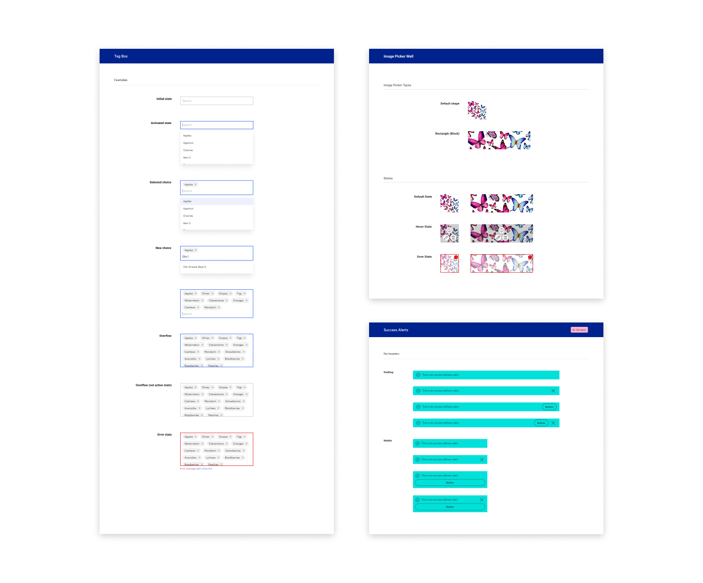
Component documentation I authored and sent to the design systems development team.
Purpose, anatomy, sizing constraints, placement rules, and behavior — including auto-dismiss timing and mobile differences.

Linear and non-linear variants, clickable states, full walkthroughs, and how the pattern adapts on mobile.

Once components were built, I replicated them in the Figma library that UX teams across the company installed into their projects — using auto layout and variants so every state and status was a click away.
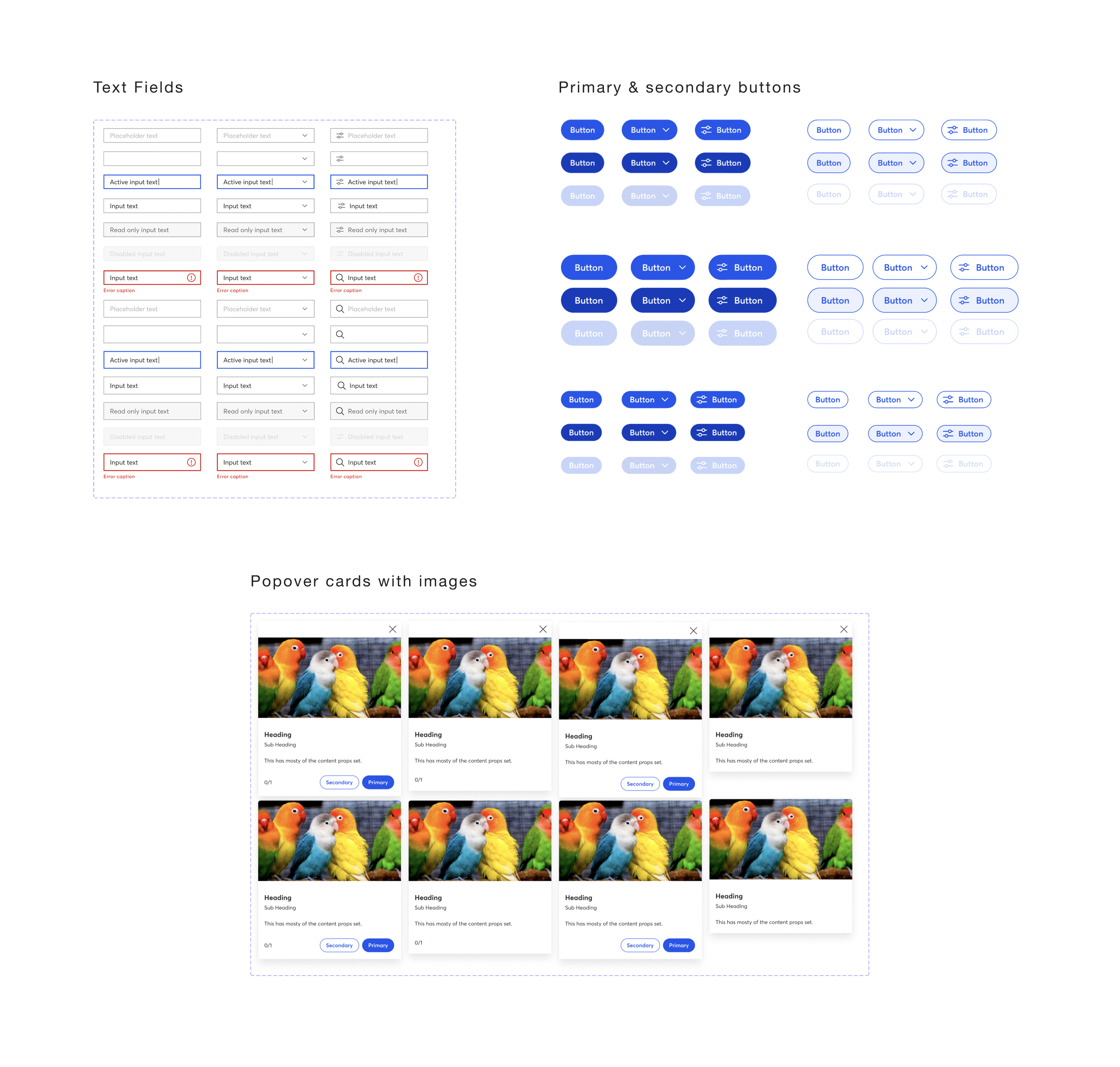
Because components have many states, I maintained stickersheets: visual references of every variation, so designers could grab exactly what they needed without rebuilding it. I also ran Figma tutorials throughout the year on working with variants and styles.


Alongside the design lead, we rebranded Constant Contact's entire component library.
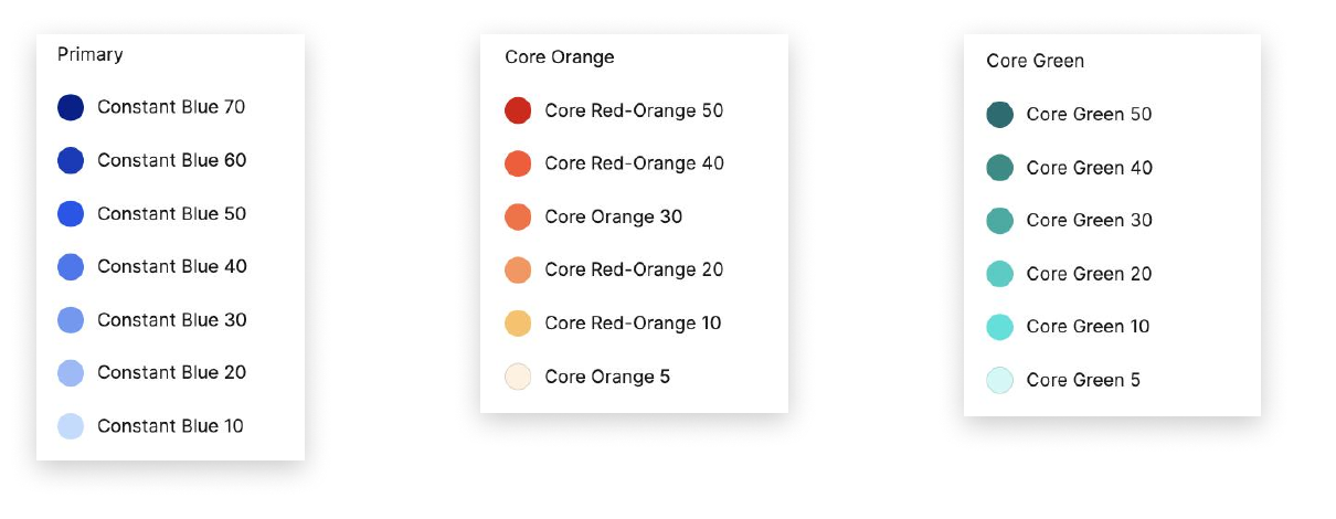
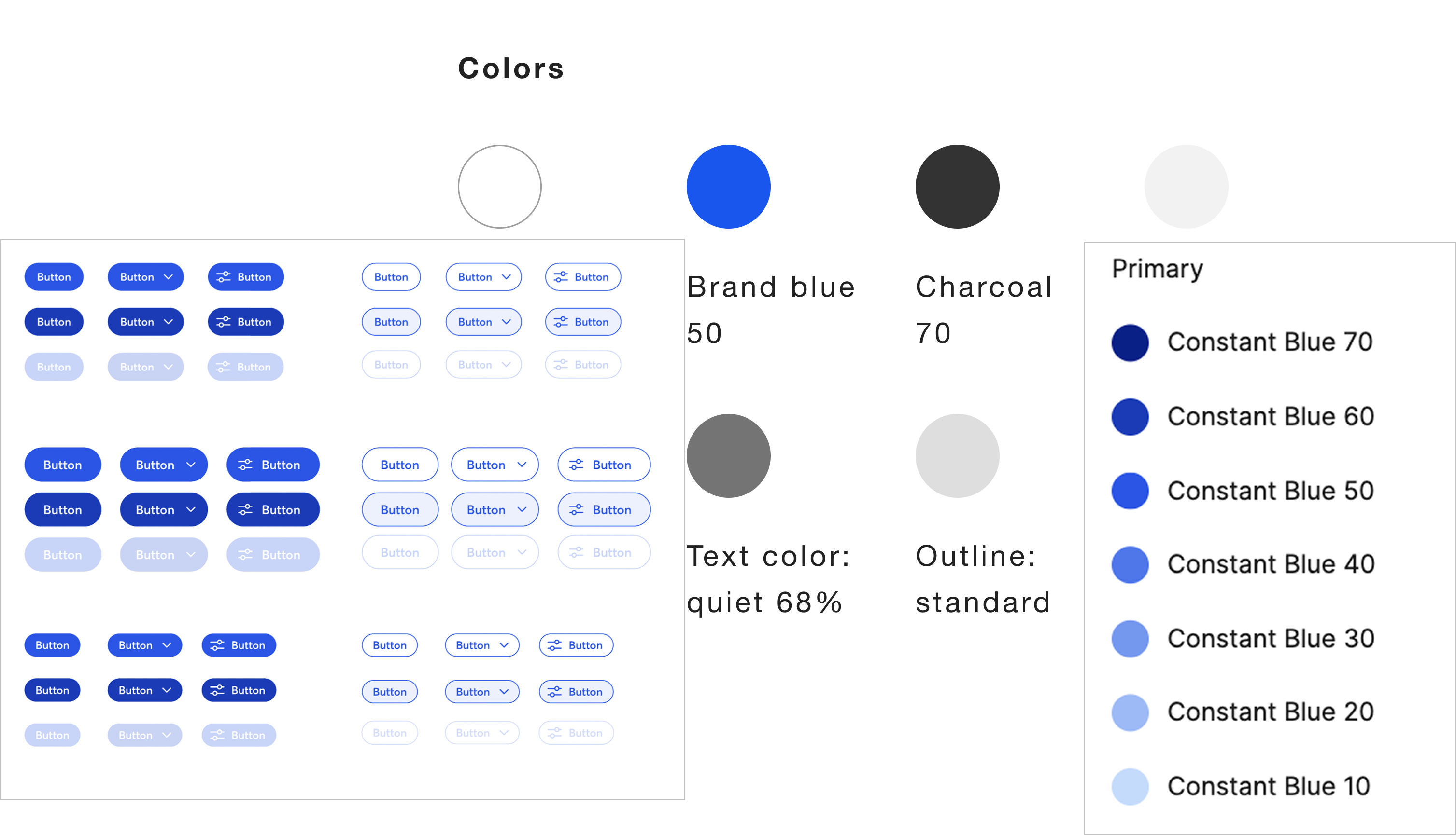
The library followed an atomic design structure — so the rebrand started with the atoms: colors, font styles, lines, shadows. Transition a swatch like 'CTCT Blue 50' to 'Constant Blue 50', and every component holding it updated automatically — buttons, metric cards, states, outlines.
Some screens also got structural redesigns for a more contemporary look, and every change was reviewed with the dev team to keep styles integrated in code with no one-off values left behind.

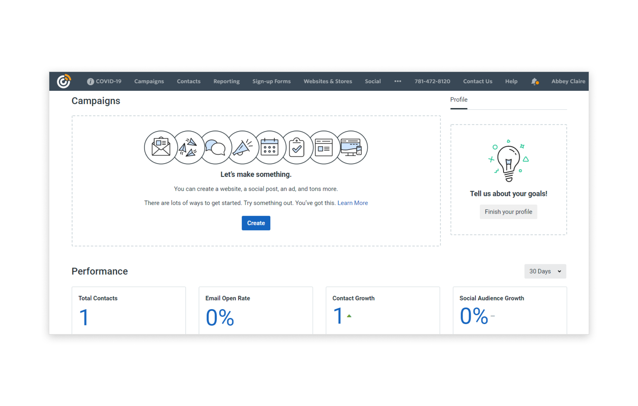
The previous look — varying shades of blue, dated shapes and illustrations.

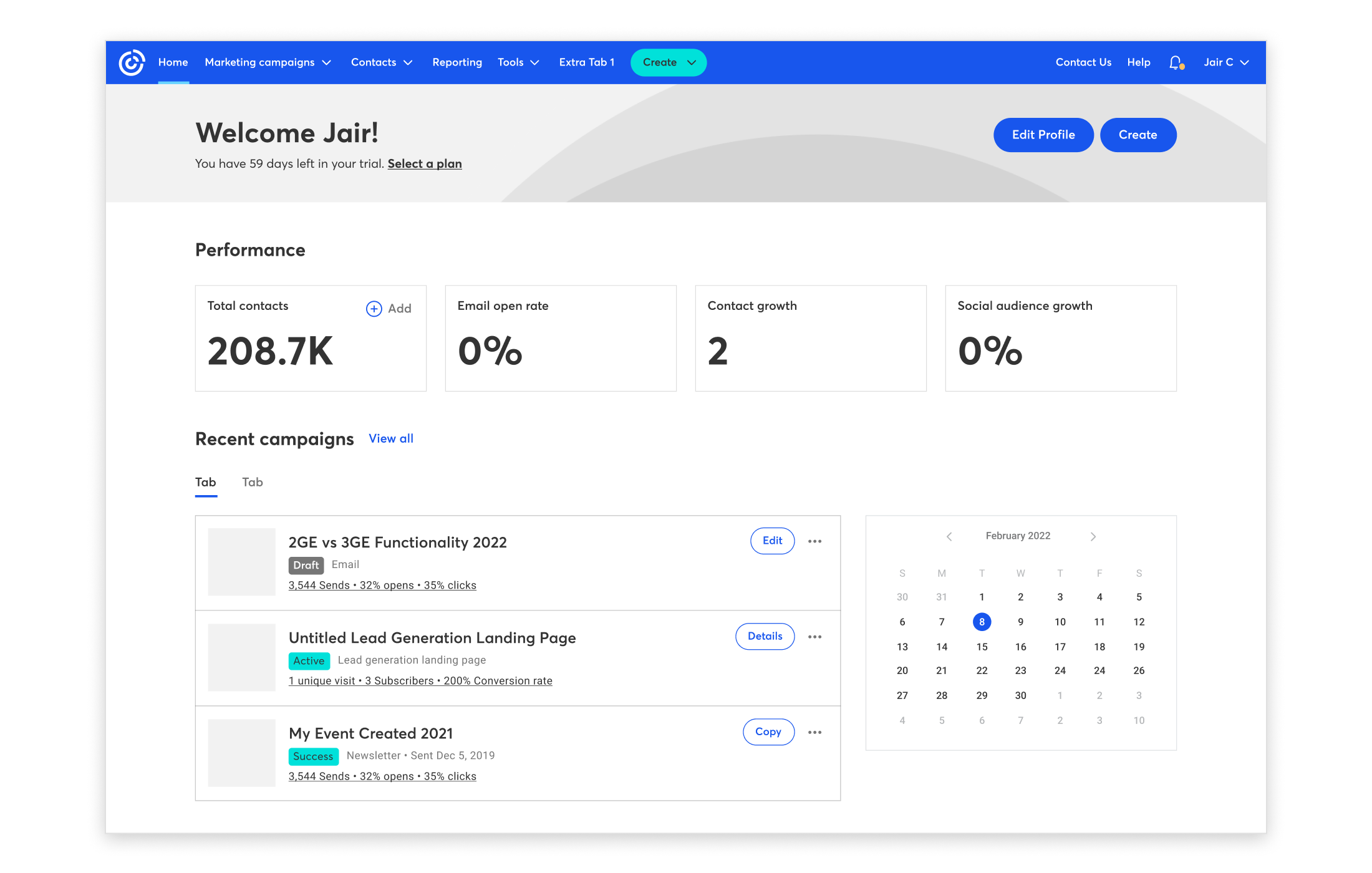
New base styles, fonts, and illustrations — plus structural redesigns.

A design system isn't a component warehouse — it's styles, fonts, effects, and states that integrate. Even the smallest element impacts the larger whole.
Understanding designers' requests, users' needs, and code limitations — every component balanced all three.
Consistent maintenance kept every screen integrated — making sweeping changes, even a full rebrand, dramatically simpler than updating screens one by one.